Color appear around us in every things and them always have a relation with other near colors that can impress our eyes. Have you ever felt that? Whether you’re reading a magazine or following directions on the subway, color plays an important role in all of our daily activities. As designers, it’s a way for us to express our emotions, feelings or make things stand out. There are many apps that explain basic color theory, but today we’ll look at two. Color wheel and Color harmony.
The Color Wheel
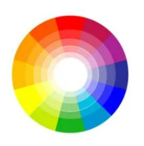
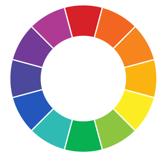 The Color wheel is exactly what it sounds like, a circle of colors. The traditional color wheel bases on red, yellow and blue (the primary colors we are taught in elementary school). However, any color circle with a well-ordered color pattern can be considered a “color wheel”. Let’s look at three different variations of the color wheel.
Primary Color Wheel
The three primary colors are red, yellow and blue. In tradition, color theory these are the 3 colors that cannot be formed by mixing any combinations or other colors. All other colors derived from mixing these three colors.
Secondary Color Wheel
Secondary colors are the second primary colors on the standard color wheel. The combination of three primary colors together creates these colors. It include: Blue mixed with Yellow will create Green, Red mixed with Blue will create Orange and Blue mixed with Red will create Violet.
Tertiary Colors
This is where things start to get a little more interesting! Mixing a primary color with a secondary color creates a tertiary color. A tertiary color is a new color expressed as a two-word name.
For example: blue (primary) + green (secondary) = blue-green.
COLOR HARMONY
Although we may not be aware of it, everything in harmony with each other always exists around us. The way your car engine runs perfectly or the way you mix the ingredients for your favorite cookies. All this is a form of harmony. Merriam-Webster describes harmony as follows: a pleasing combination or arrangement of different things.
In the case of design, harmony is found when we arrange colors in a way that appeals to the audience. Similar to the case of Goldilocks and the Three Bears, when we design something that is too boring (not enough colors) or too loud (too many colors), we can lose our audience. This is because the brain becomes bored or overstimulated to the point that it can no longer process it. The goal is to use color to create a room that is both visually appealing and stimulating in a way that the brain can process. This is the “Just Right” color harmony zone. Let’s take a look at the colors that make harmony.
Monochromatic
 In a monochrome color palette, a single base color is chosen and different shades, tones and tints of that color are used to create a harmonious and beautiful composition. This harmony draws on the inherent variety within the same color to bring depth and interest.
Analogous
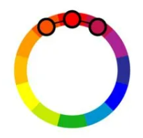 Analogous color schemes involve choosing three adjacent colors on the color wheel. Therefore, these colors share a common base color and often create a balanced and calming combination. Designer often use similar harmony to create a sense of unity and coherence in design.
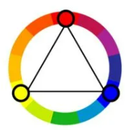
Complementary
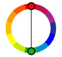 Complimentary colors are opposite each other on the color wheel, creating a highly contrasting and visually striking combination. Moreover, this harmony is known for its dynamic energy and ability to highlight elements, making it a popular choice for creating accents.
Split-Complementary
 Similar to complementary harmony, the complementary division scheme uses a base color and two colors adjacent to its complement. This achieves a balance between the dynamism of complementary colors and the harmony of similar colors, providing both contrast and cohesion.
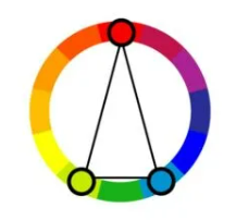
Triadic
 In triadic harmony, three colors that are evenly spaced on the color wheel are chosen. This palette provides a diverse and vibrant color palette, with each color providing a strong visual presence. It’s a great choice for creating balanced, visually appealing designs.
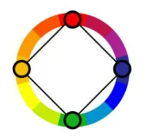
Tetradic (Double Complementary)
 Tetradic color scheme involves choosing two pairs of complementary colors, creating a palette of four distinct colors. This harmony offers many color possibilities and is often used to create complex and visually stimulating compositions.
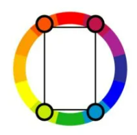
Square Harmony
 Square color harmony, also known as rectangular or quadrangular harmony, uses 4 colors evenly spaced on the color wheel. This color palette offers a balanced mix of warm and cool colors and is ideal for creating harmonious and visually appealing designs with a bit of contrast.
Each of these seven color harmonies offers unique aesthetic appeal and can be used strategically in design and art to evoke specific emotions, convey a message or simply creating visually appealing experiences.
Contact us if you have any questions.
Moreover, Don’t forget at VincentColor we provide Real Estate Photo Editing Service only from 0.5$
Website: https://vincentcolor.com
Email1: Contact@vincentcolor.com
Email2: Cs@vincentcolor.com