A color scheme, also known as a color combination or palette, refers to a set of colors chosen and arranged in a specific way to create a beautiful and cohesive layout or design. Color schemes are commonly used in many different fields such as graphic design, interior design, web design, fashion and art to convey a specific mood, message or aesthetic.
The ideal color palette can evoke specific emotions, create visual harmony, and convey your message effectively. In this blog, we’ll explore the art of choosing the perfect color palette to showcase your design projects.
You may be interested: Color Scheme Sources
Tips To Choose The Ideal Color Scheme
High Contrast
First, it’s important to create slides that emphasize contrast to maximize their impact. For example, consider a scenario that uses a dark background. In such cases, it makes sense to choose a lighter font.
Additionally, when working with a monochrome palette, it’s important to highlight key elements using complementary colors at the opposite end of the color wheel.
It is essential to understand that contrast is not simply about choosing different colors, but also about choosing colors that create the most visual appeal when placed next to each other.
Since all pure colors have the same degree of saturation (indicating the intensity of a color) and value (reflecting lightness or darkness), using only pure colors tends to create a dull color palette. This emphasizes the importance of combining different tones, shades and hues for an attractive presentation.
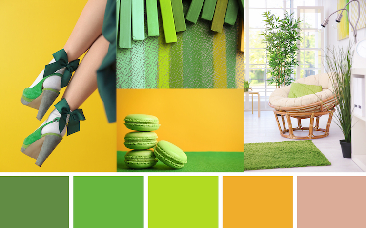
For instance, in the color palette shown below, the inclusion of a variety of tones, shades, and hues makes it especially eye-catching.
The 60-30-10 Rule
According to advice from popular presentation company Ethos3, achieving a balanced presentation can be made simpler by following the 60-30-10 rule.
Specifically, if you have chosen a color palette of three colors, as advised earlier, the suggested rule is to allocate 60% of the slide space to the main color, reserve 30% for secondary colors and reserve 10% for accents. color.
Keep It Simple
You’ve probably heard this advice before, but it’s worth repeating: In design, simplicity often prevails. Try to maintain a minimalist approach, avoid using too many colors. In general, three to four colors are enough for a presentation.
Spread Content Out
Another simple rule of thumb is to divide your content into digestible sections spread evenly throughout your presentation, ensuring maximum accessibility.
Gone are the days when presentations lasted 10 or 15 slides. In modern times, engaging presentations designed to be viewed in less than three minutes can include 50 to 60 slides.
Why is this the case? Well, fewer slides usually means cramming a larger amount of information into each slide. Conversely, a higher number of slides lets you use more images and rely less on text to convey each concept effectively.
Contact us if you have any questions.
Moreover, Don’t forget at VincentColor we provide Real Estate Photo Editing Service only from 0.5$
Website: https://vincentcolor.com
Email1: Contact@vincentcolor.com
Email2: Cs@vincentcolor.com