Color is a powerful and versatile tool that humans have used for centuries to express emotions, convey messages, and create visual harmony. Whether you’re designing a website, decorating your home, or choosing an outfit, understanding the meaning of colors and effective color combinations can have a huge impact on the way you communicate and the aesthetic you create.
In this blog, we’ll delve into the fascinating world of color, explore its meanings, and offer tips on how to mix colors for a variety of purposes.
Read more: Basic Color Theory – Color Wheel
Color Meaning
The colors aren’t just pretty; they also carry symbolic and emotional meaning. These meanings may vary across cultures, but there are some common associations that many people share. Let’s take a closer look at the meanings of some basic colors:
- Red: passion, romance, anger, power
- Orange: optimism, enthusiasm, happiness, vitality
- Yellow: happiness, hope, creativity, warmth
- Green: fertility, nature, abundance
- Blue: professionalism, calm, transparency
- Purple: luxury, royalty, creativity
- Black: elegance, mystery, darkness
- White: purity, cleanliness, peace
Color Combinations
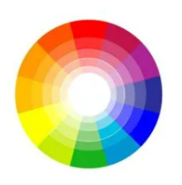
To do this, we must firstly learn the different classifications of colors, depending on their placement on the color wheel. It is also two ways to make a color combination harmoniously.
Classify Color
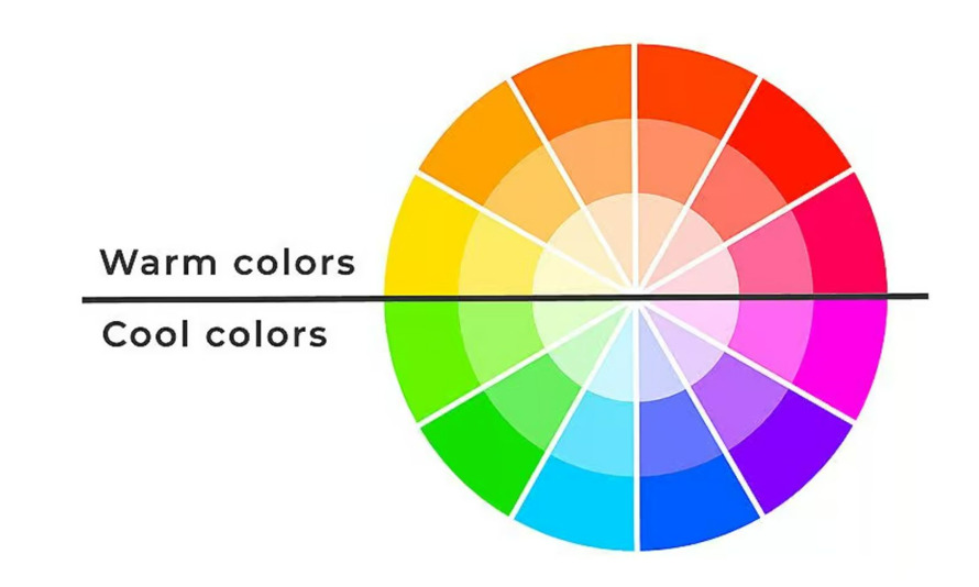
| Warm Colors
For example, the warm colors on the wheel are the reds, oranges and yellows |
Cool Colors
On the opposite side are the cool colors: the greens, blues and violets |
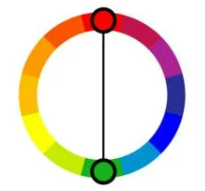
Complementary Colors
Complimentary colors are opposite each other on the color wheel. Their combination creates high contrast and energy. Examples include opposite of orange is blue or opposite of red is green.
Analogous Colors
Analogous colors are next to each other on the color wheel. They create a feeling of harmony and cohesion. For example, combining different shades of blue and green can evoke a calming and natural atmosphere.
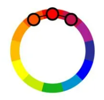
Split Complementary Colors
This color scheme uses a base color and two colors adjacent to its complementary. It provides a balanced yet contrasting look. For example, combine red with yellow-green and blue-green.
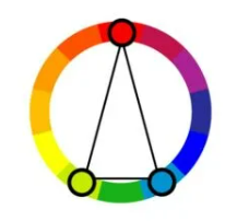
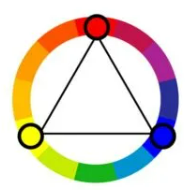
Triads and Tetradic Color Combinations
Triadic color schemes consist of three colors evenly spaced around the color wheel. This combination brings balance and dynamism. An example would be red, blue and yellow.
Monochromatic Colors
Monochromatic color schemes use variations of a single color. This approach is elegant and easy on the eyes. For example, shades of blue from light to dark can create a subtle and calming effect.
Contact us if you have any questions.
Moreover, Don’t forget at VincentColor we provide Real Estate Photo Editing Service only from 0.5$
Website: https://vincentcolor.com
Email1: Contact@vincentcolor.com
Email2: Cs@vincentcolor.com